Introduction: The Power of Color in Design
Have you ever walked into a room and felt instantly calm or energized? It wasn’t just the furniture or layout; it was the colors. Color has a strong influence on our emotions and behaviors, whether in fashion, interiors or even branding.
The choice of fabric colors in design goes beyond mere aesthetics. It can evoke specific feelings, communicate messages and even shape cultural identities. From the soothing shades of blue in home decor to the bold reds in fashion, colors speak to us in ways words cannot.
In this post, we will explore how color psychology impacts fabric selection and how cultural influences shape those choices. Whether you're a designer or just someone curious about the psychology behind fabric choices, this guide will help you understand the importance of color in the design.
What is Color Psychology?

Color psychology is the study of how colors affect our emotions and decisions. Colors can trigger emotional responses, shape our moods and even influence how we make choices. Understanding these effects helps designers choose the right colors for fabrics, clothing and interiors.
Psychological Impact of Color on Emotions and Decision-Making
Colors influence our feelings on a deep level. For example:
-
Blue: Known for its calming effect, blue can help reduce stress and create a sense of tranquility.
-
Red: This color can boost energy, increase heart rate and even make people feel more excited or urgent.
- Yellow: Often associated with happiness, yellow can uplift moods and inspire optimism.
These color effects are powerful tools for guiding people's emotional responses and decisions.
How Color Affects Mood and Perception
Colors are more than just aesthetic choices; they shape how we perceive a space or a design. The right color can:
-
Create warmth: Red, orange and yellow are warm tones that make spaces feel inviting and energetic.
- Promote calm: Soft blues, greens and purples help reduce anxiety and create a soothing atmosphere.
When choosing fabrics, consider how color will make people feel. Will it energize them or help them relax? The right color can elevate the design and the experience.
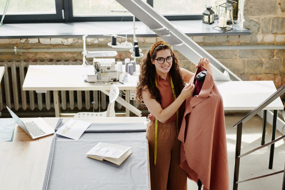
The Connection Between Color and Fabric

Why Color Matters in Fabric Selection
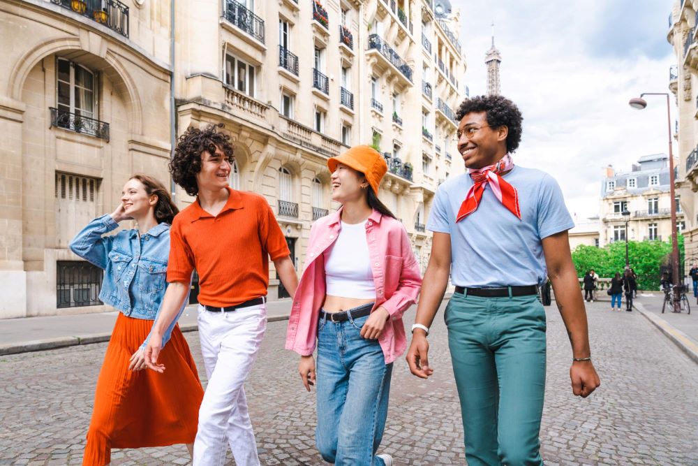
Color is an important part of how we see fabrics and products. The right color can make clothes look fancy or casual. It can change the mood of a room or design project.
When choosing fabric colors, you’re not just picking a color; you’re creating an experience. In fashion, bold colors can show confidence, while soft colors feel calming and friendly. In-home decor, colors like deep green or brown can add warmth, while grays and whites give a fresh, clean feeling.
How Colors on Fabrics Influence Product Perception
-
Fashion: The color of clothing communicates personality. Bright colors grab attention, while muted tones feel sophisticated.
- Interior Design: Fabrics in rich colors like deep red or navy blue can make a space feel luxurious. Lighter shades, like pastels, can open up a room and make it feel airy.
Choosing fabric colors carefully shapes how people feel about a product or space. A vibrant fabric can bring energy, while a soft hue can create a calming effect.
The Impact of Texture and Material on Color Perception
Fabric texture affects how we perceive color. The same shade can look different depending on the material.
-
Matte fabrics: Colors on matte surfaces tend to look deeper and more subdued.
-
Shiny fabrics: Glossy materials reflect light and make colors appear brighter and more intense.
Texture and material don’t just affect the visual appearance. They also influence how we feel about the fabric. A shiny fabric may feel more formal, while a matte one feels more casual and approachable.
How Culture Shapes Color Preferences
Cultural Significance of Color in Different Regions
Color meanings change across cultures. A color that is positive in one culture may hold a different meaning in another.
-
Red in China: Red symbolizes luck and prosperity. It’s a color often used in celebrations like weddings and the Chinese New Year.
-
White in Western cultures: White is linked to purity and weddings, while in some Eastern cultures, it’s associated with mourning and funerals.
- Black in Western cultures: Black is often linked to sophistication and authority but is seen as a color of grief in many other cultures.
Understanding these associations helps when choosing colors for international designs or global markets.
Case Study: Color Preferences in Eastern vs. Western Design
Eastern and Western design aesthetics differ in their use of color:
-
Eastern design: Color palettes tend to be more subtle and symbolic. Colors like red, gold and jade green hold deep meanings and are used strategically in fabrics to convey status, spirituality and luck.
-
Western design: Color choices are often bolder, with more emphasis on trends and aesthetics. While red may represent passion or love, it may not carry the same symbolic weight as it does in the East.
When designing fabrics for different markets, understanding these cultural preferences helps create designs that resonate with specific audiences.
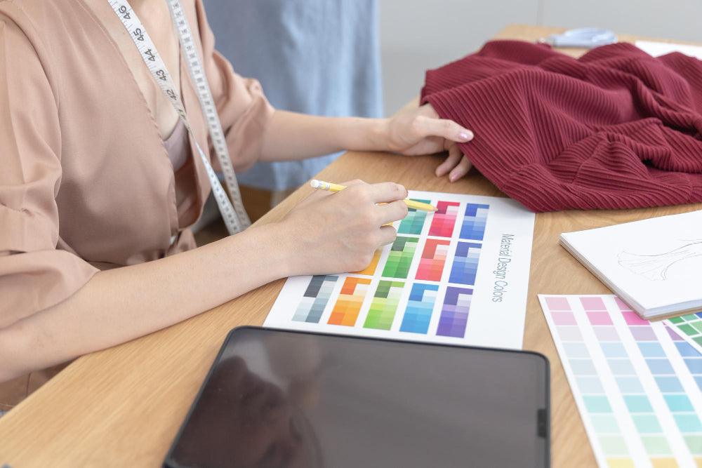
How to Use Color Psychology in Fabric Selection for Your Designs

Colors have power. They can set the mood, evoke emotions and even influence buying decisions. Here’s how to choose fabric colors based on psychological impact.
-
Red: Passion, energy and urgency. Ideal for bold designs or call-to-action products.
-
Blue: Calm, trust and professionalism. Great for corporate wear or home decor.
-
Green: Nature, balance and health. Perfect for eco-friendly or wellness-related products.
-
Yellow: Optimism, creativity and warmth. Use for youthful and cheerful designs.
-
Black: Sophistication, power and elegance. Works well for formal wear or luxury items.
- White: Simplicity, purity and cleanliness. Good for minimalist styles or healthcare fabrics.
Experiment with combinations to achieve the right emotional tone for your design.
Suggested Tool for Color Palettes for Fabric Selection:
|
Tool |
What It Does |
Key Features |
|
Helps you create color schemes quickly. |
|
|
|
Allows you to create and explore color palettes with a color wheel. |
|
These tools help you pick the right colors for your fabrics, making your designs look great and feel right.
Importance of Considering Cultural Sensitivities in Global Markets
When selecting fabric colors for international markets, you must understand their cultural meanings.
-
Red: In the West, it represents passion, but in China, it’s a symbol of good luck and celebration.
-
White: In the West, it’s linked to purity, while in some Asian cultures, it’s associated with mourning.
- Black: Seen as elegant in many cultures but can symbolize death or bad luck in others.
Be mindful of these cultural associations. Choose colors that will resonate with your target audience without causing offense.
The Future of Color Psychology in Fabric Design

Emerging Trends in Color Psychology
Color psychology evolves based on cultural shifts, consumer preferences and psychology research.
-
Bold and Neutral Combinations: Designers blend bold colors with neutral tones. This provides balance while making a statement.
-
Sustainability Focus: Eco-friendly colors, such as earthy greens and muted tones, reflect growing environmental awareness.
- Mood and Emotion: Colors like blue and green remain popular for calming fabrics. Red and yellow are favored for energizing and stimulating designs.
- These shifts guide how brands and designers select colors, aiming to connect emotionally with consumers.
How Technology and AI are Influencing Color Choices in Fabric Design
Technology and AI tools are changing how color is chosen for fabric designs.
-
AI-Powered Predictions: Programs analyze current trends and predict popular color combinations.
-
Real-Time Feedback: AI provides instant feedback, allowing designers to refine choices quickly.
- Data-Driven Insights: AI collects data from online behavior to suggest colors that appeal to specific demographics.
Designers can now create fabrics that resonate with their audience by relying on AI for precise color decisions.
Conclusion
Color psychology and cultural influences are powerful factors when it comes to choosing fabrics. The right colors don’t just make a design look good; they evoke emotions, set the tone and help communicate the underlying message. As a designer, it's essential to consider both the psychological effects of colors and their cultural significance.
Every color choice matters and it's worth taking the time to think about how your fabric selection connects with your audience. A little thoughtfulness in choosing colors can elevate your design, creating a stronger and more meaningful connection.
FAQs:
1. What is the role of color psychology in fashion design?
Color affects how people feel and how they perceive the designer's message. Designers use colors to express emotions or create certain moods. For example, red can evoke energy or excitement, while blue may give a sense of calm.
2. How does cultural background affect color preferences in interior design?
Colors hold different meanings in various cultures. For instance, white symbolizes purity in some cultures but may represent mourning in others. Designers must consider these meanings when choosing colors for global markets.
3. What colors are considered calming in fabric design?
Soft tones like light blue, pastel green and lavender are known to promote relaxation. These colors work well in spaces meant for rest or relaxation, such as bedrooms.
4. Can color psychology influence buying decisions in the textile industry?
Yes, the right colors can drive sales. Warm colors like red or yellow can grab attention, while cool colors like blue or green can make customers feel calm and secure. Choosing colors that resonate with customers can improve product appeal.
5. How do texture and fabric type impact the perception of color?
Fabrics with shiny textures, like silk, can make colors appear more intense. Matte fabrics like cotton may make the same colors seem softer. The texture of the fabric can change how we perceive the color.
We also happen to be a magnet for suggestions, and would love to catch yours….throw us yours on hello@fabriclore.com
Learn, Create & Grow with us ![]()
![]()